the eye poster
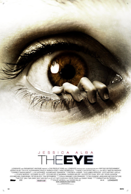
it has the directors or main actresses name on top of the main title to showcase it and use star power
it has the company's logo and the other stuff in smaller writing so it doesnt take away from the important parts (sell lines)
they use layowt to focus on the main message and to make the cover look less overcrouded
Comments
Post a Comment